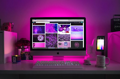
Colors play a crucial role in web design. They can evoke emotions, affect user behavior, and influence brand perception. Understanding the psychology of colors is essential to creating a website that resonates with your audience and meets your business goals.
Color Theory: Understanding the Basics
Color theory is the study of how colors interact with each other and how they can be used to communicate different messages. The basic principles of the color theory include:
- Hue: This refers to the actual color, such as red, blue, or green.
- Saturation: This refers to the intensity of the color.
- Value: This refers to the lightness or darkness of the color.
Using Color Psychology in Web Design
Color psychology is the study of how colors can influence human behavior and emotions. Different colors can evoke different feelings and reactions in people. Here are some common associations with different colors:
- Red: Passion, energy, excitement, urgency.
- Blue: Trust, security, reliability, calmness.
- Green: Growth, health, nature, freshness.
- Yellow: Optimism, happiness, friendliness, caution.
- Purple: Creativity, luxury, royalty, spirituality.
- Orange: Warmth, enthusiasm, energy, creativity.
- Black: Elegance, sophistication, authority, power.
- White: Purity, simplicity, cleanliness, innocence.
Choosing Colors for Your Website
When choosing colors for your website, it's essential to consider your brand personality, target audience, and marketing goals. Here are some tips to help you choose the right colors for your website:
Consider your brand personality: Your website's colors should align with your brand personality and values. For example, if you run a luxury brand, you may want to use colors like gold, black, or purple.
Understand your target audience: Different colors can appeal to different demographics. For example, if your target audience is mostly women, you may want to use colors like pink, purple, or blue.
Use contrasting colors: Using contrasting colors can make your website more visually appealing and easier to read. For example, using a dark color for the text on a light background can make it easier to read.
Don't use too many colors: Using too many colors can make your website look cluttered and confusing. Stick to a color palette of two to four colors.
Test different color combinations: Experiment with different color combinations to see what works best for your website. A/B testing can help you determine which colors are most effective at achieving your goals.
Conclusion
Colors are a powerful tool in web design. By understanding color theory and color psychology, you can choose the right colors for your website that align with your brand personality and appeal to your target audience. Whether you're designing a new website or revamping an existing one, taking the time to choose the right colors can make a significant difference in your website's success.
Also, Read this Article :


